
Chapa-De Brand
Category
Branding, DesignAbout This Project
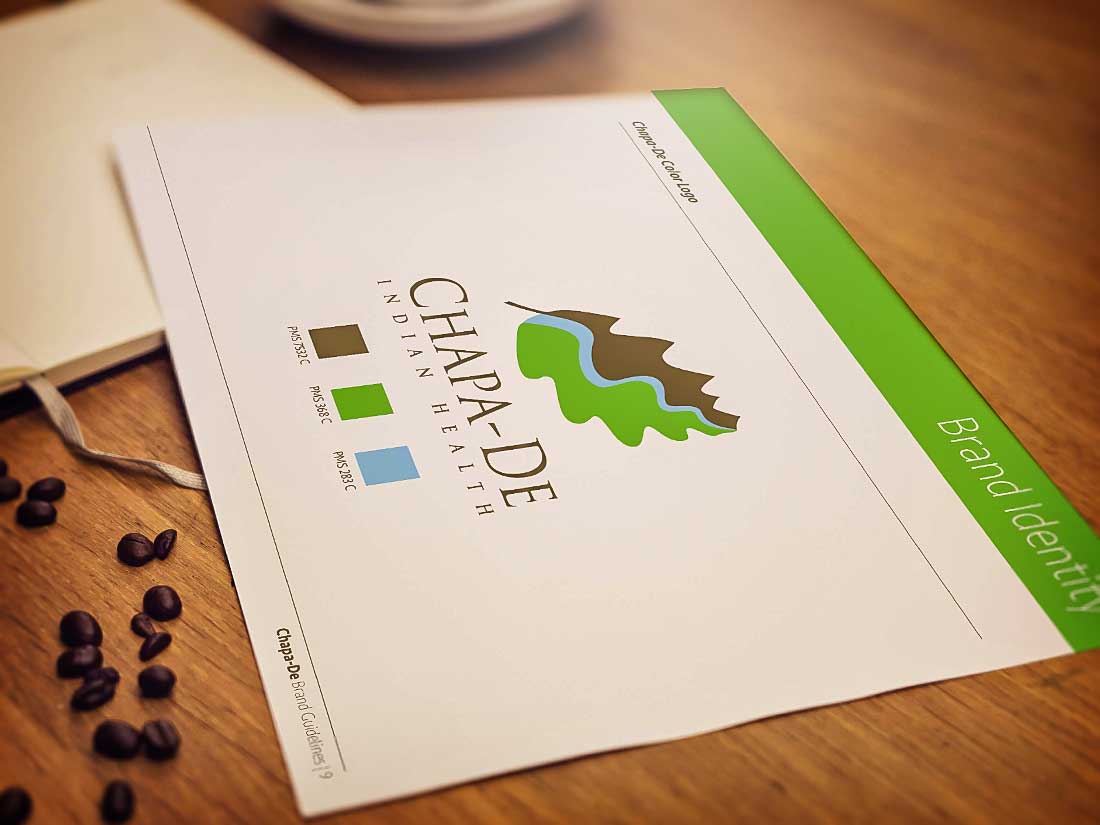
Chapa-De operates two private, non-profit community health centers that provide no-cost or low-cost services and medications to verified American Indians/Alaska Natives from federally recognized tribes, as well as low-income individuals and families. Since its creation in 1974, Chapa-de had never been professionally branded. The logo culminated from a series of discussions about the origin of the name Chapa-De, which means “where the mountains meet the valley.” The result, after several renditions, utilized representations of the mountains and valley, joined together by the river, symbolizing the health centers and their importance to the community. With a strong understanding of the history and the significance of the oak leaf in American Indian culture, Corvus attempted to connect the origin of the name with the importance of the oak leaf. This concept culminated into what has resulted in the official Chapa-De logo.
If you would like us to do the same for you, please set up a FREE consultation to discuss the many ways Corvus Communications can help your business. Let’s Meet!